When I was learning to trade Tennis, I wasn’t sure what I should be doing, when I should be getting in or out of a match, or where the critical points were.
So I invented a way to interpret what I saw, which I still do in tennis matches. It allows me to trade them more effectively and see critical points within a match. I may have snuck one of these in on a video in the past, but I thought it was about time that I talked about exactly what I do and how it can help you trade a tennis match.
Standard Betfair charts
You often see lovely charts in a Tennis match like this one: –
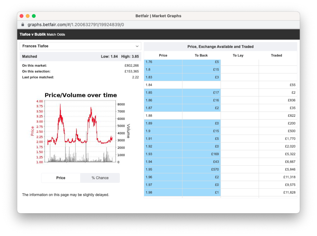
When you see a chart like this, it’s obvious what the entry and exit points would be. Even more so when you add in the score in the match. But of course, not all charts are this easy, and there are no scores available on the charts on Betfair.
Why I create a profit graph
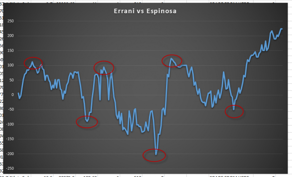
One of the things that I do when I’m trading tennis is to get bet Angel to monitor how a particular position is going.
The two features I use are Tennis trader and automation. They both work in the background for me while I trade or even on another machine to collect data on a market I may or may not be trading.
I do this in many markets, particularly in tennis, because it clearly illustrates the key points within a tennis match and how I could have traded them more effectively.
I am pulling in data from the market I am trading, which allows me to analyse my performance or the critical trading points in the market. Regardless of how I traded during the match, I’ll look at this data afterwards and make notes which I can carry forward.
In the first graph, I am more concerned about where the profit was during the market.
You can see I’ve circled the top and bottom of the market, but if you glance to the left, you can see the swing in profit or loss that occurred with a fixed stake. I’m measuring the profit (or loss) I was in at different points in the match.
It’s a good illustration of the benefit of trading against betting in a match.
From a betting perspective, the market settled in favour of only one selection, but you could profit on either several times if you were trading.
More complex data
The second data set is more concerned with how to trade the market and where the critical profit points were regarding the total opportunity available in the market.
By that, imagine squashing the first graph to the left and adding up those swings. That gives you the total opportunity and where it would have been best to trade in and out.
Looking at this data allows you to understand where the key points were in a market and where to find them in future. All you need to do is nip into the market in front of it. But that’s often harder than it sounds!
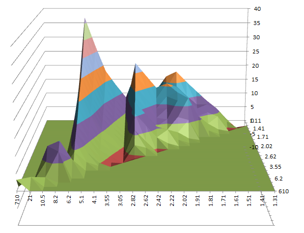
Of course, Bet Angel also has live score data, so you can overlay that on an individual graph or aggregate them all together to get an excellent view of where the opportunity was in a market.
By learning what worked in the past and why you can approach future markets with much more confidence. You will know the key opportunities, and your job as a trader is to anticipate when these markets are about to occur and nip in and out around these points.
Since the introduction of live race course data, I know also create this for in-play horse racing markets similarly.
Each Monday, I’ll spend a lot of time analysing and reviewing the data to improve my knowledge of how a sports trades and why, using this exact technique.